Every year, the way we look to design small business websites shifts and changes as trends come and go. There are new tools, new functions, new trends and new designs that appeal to the masses – of which all need to be factored in for the ultimate user experience.
We like to think we're well on-trend with the latest chops and changes in the web industry, having worked in the trenches for a number of years now. So, if you're looking to find out how to jazz up that SMB page of yours, and allow it to function better overall, we've got a few nifty tips up our sleeves. Read on to see how you can attract a wider audience and gather more click-throughs and purchases this year.
Defying symmetry
In design terms, the layout has an invisible grid of horizontal and vertical lines that elements are placed in.
Traditionally, these elements would stay in the lines of the grid and have a sense of symmetry, which is why a lot of websites have a sameness about them.
To stand out, more and more designers have been breaking out of these boundaries and placing objects asymmetrically for a different approach, look and feel. And you can expect this trend to rise to prominence this year, as creatives look to mix things up a bit.
Overlapping elements
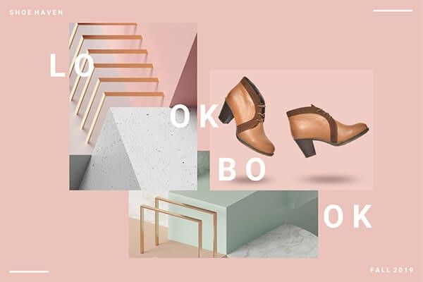
One of the key ways designers are breaking symmetry is crossing elements over each other.
Instead of having a simple image, header and introduction all stacked neatly across the page, designers are instead positioning the images in more out-of-the-box ways, in order to combat that 'cookie cutter' look. Letting elements invade the space of other ones is going to be a hit this year, so keep your eye out for ways you can incorporate this into your layout.

Notice this example from PicMonkey and its use of overlapping elements
Pro tip: the trick is to create an artistic vision that remains uncluttered, and without obscuring critical information. It takes a bit of balancing, but once you get it right, the results are well worth it.
Incorporating irregular shapes
Website elements traditionally fit into regular shapes like squares, rectangles and triangles. In 2019, however, expect more designers to stray from these classics to experiment with organic shapes and lines that shatter the 'clinical look' of websites.
These irregular alternatives can take on the form of a theme in line with the website, fitting elements into shapes that specifically fit the business it's mirroring (e.g. pool-shaped items for a company that installs and constructs pools).
Bringing nostalgia into the modern age
Retro culture is hugely popular right now and this can be applied to your site through clever design that fuses new methods with old ideas.
We're not talking about a return to the websites of the 1990s (if you need a reminder, go to spacejam.com.au, which remains intact to this day). We're talking clever designers who are taking themes from pre-internet eras and bringing them to life on the screen.
Using throwback elements that pay homage to vintage design concepts and inspiration, you'll commonly see these features in the hip cafe scene in Melbourne – just to give an example.
Vintage typefaces
Speaking of retro, to complement sleek, modern websites, many designers are adding a vintage touch through the use of fonts.

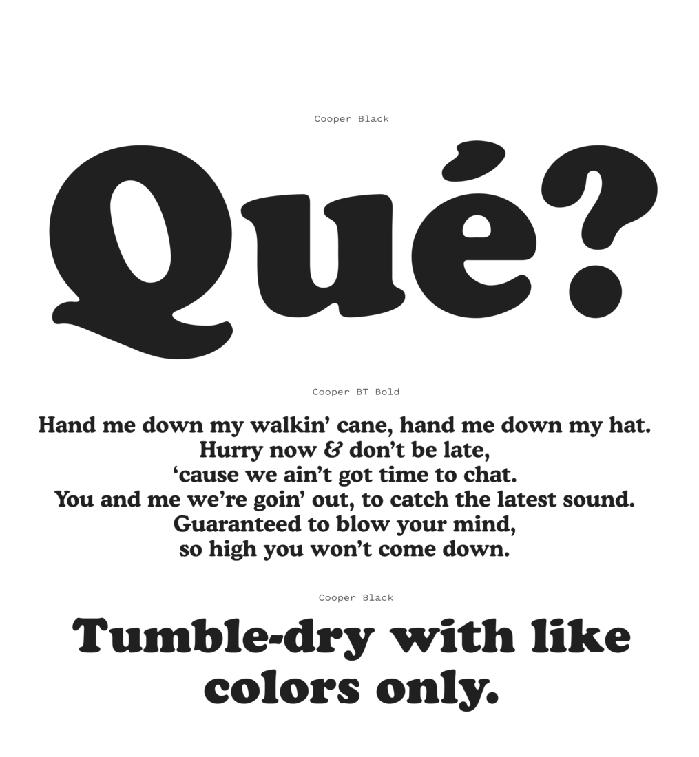
You’ve probably seen this crowd-favourite font – Cooper Black – around lately. Image source: Font Review
These typically include fonts like Cooper Black, Vesterbro Black and Recoleta – bringing back an era of print newspapers to bring warmth and retro feel to websites.
Getting clever with images
Perhaps it is the rise of DIY website creation CMS sites like Squarespace and Wix, but lately, we're seeing a return to massive hero images that take up almost the entire home screen.
In many cases, this has been replaced by short video loops that sit behind that text and spread across the page. These are visually attractive, alluring and collect attention (or demand it) from users who are intending on just stopping by. But they're not always personalised.
However, this will shift slightly this year, with designers working more towards user-orientated, engaging and relevant images that strike an impact, throwing stock options out the window. Think a more tailored, less blanket approach.
Make your heading the hero
In other cases, some designers are doing away with images on the homepage, whatsoever. Instead, they're utilising hero headings to create an artistic flair, incorporating design elements (like those we've mentioned earlier) to create an edgy appeal.
Google has used this technique for years, altering its logo to suit modern events or anniversaries, but websites have not typically followed suit. Until now.
Video, video and more video
As more and more web users turn to mobile devices and lifestyles become more hectic, video content is becoming more critical than ever before.
Often, people don't have the time or inclination to go through volumes of text and will instead embrace short video snippets to get their 'fix' instead.
This is usually favoured by SEO as well, with Google preferring pages with mixed content over ones with standard text and images.
Making your site mobile-friendly
On the topic of people using mobile devices, the design is moving more towards being thumb-friendly.
Sites that are easy to navigate and functions that stand out and are easy to press on a mobile device are going to appeal more to consumers across the board in 2019.
Most users are used to scrolling and using their device with their thumb, so placing elements in places where they don't have to pick at the screen with their fingers optimises their experience. It also increases the likelihood of conversions, and we all like a bit of that.
The rise of AI and the chatbot
Artificial intelligence has advanced to the point where chatbots are becoming an essential part of the modern website. Certainly, in 2019 we are going to see consumers demand more of these features on platforms they like to frequent.
This is an excellent opportunity for designers. Chatbots go far beyond those annoying (and hardly helpful) message boxes where you are greeted by a robot named Frank asking "how can I help you today?".
Instead, AI is allowing for more personality in chatbots, with designers able to give them names, images and flair. These bots can become mascots for brands and a hugely influential digital receptionist and guide.
If you haven't learned to code, do it
There has been a quiet discussion and debate over recent years over whether the modern designer should learn to code at all.
The thing is, many designers didn't want for an answer and just went ahead and learned it anyway.
This has resulted in new design tools like Figma or Framer X which give these creatives way more scope to create custom functions and designs for websites. This will be one of the big things in the years coming, so if you haven't learned to code just yet, it's time to jump onboard. Alternatively, let our experts take care of the hard yards for you.
Stripping sites of colour
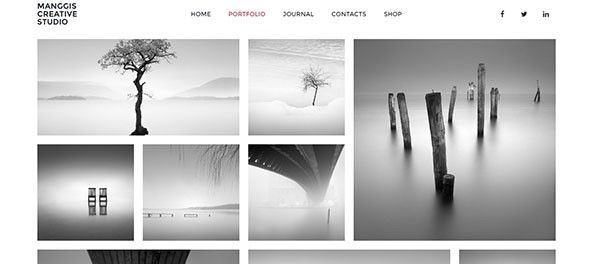
Even though we now have access to gazillions of different colours, websites of the future will ignore almost all of them.

Image source: Line25
Monochromatic and black and white platforms are back in fashion, which typically places the spotlight on your branding and message, without the bells and whistles.
More than enough white space
The absence of colour can be used in another fashion. Rather than stripping the site of colour completely, a new trend is to allow for white space with simple, elegant, plain black text across it.
Previously, we have used this white space to give readers a respite from reading – a chance to rest their eyes. It was used sparingly to ensure a website was not too cluttered.
Now, it can be used to create a focal point on your site – and it really helps make your images stand out as well.
Making navigation the hero
This is treading on some pretty new ground. Navigation panels are changed up regularly, usually because they're the most challenging aspect of a website to get right, or don't usually stay stagnant for long.
Typically, you'll see them sitting in a smaller font at the top, bottom or side of the page. But what if we made them the hero instead?
Bold new designers are making the navigation panels the centrepiece of the website, with giant buttons that introduce navigation as the primary function of the website.
The return of 3D
Cookie-cutter website design sites, bottomless pits of stock images and new applications like Slack that favour flat models – these have been the killers of 3D graphics to date. But this is set to change with these standout images making a comeback, allowing sites to stand out in a sea of pages that are all starting to look the same.
Improved technologies mean these 3D images can now be animated and have functionality as well – like navigation and payment options where the user can get a kick out of interacting with these elements.
The continued rise of brutalism
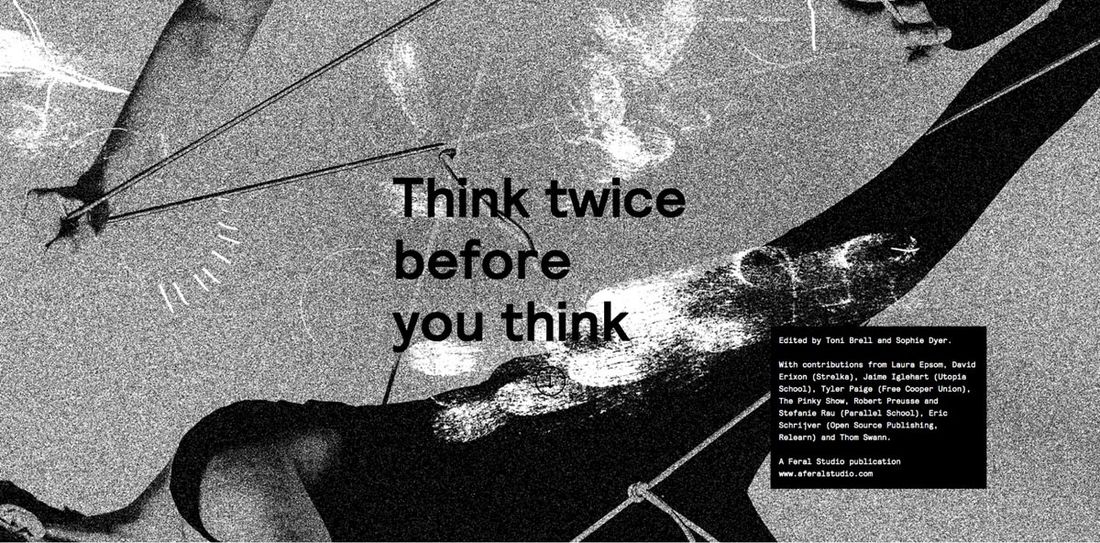
Every culture has a counter-culture, with brutalism being the web design equivalent of a punk revolution. It has been used since the internet became mainstream in the 90s, but has slowly begun to take off ever since.
For the uninitiated, this style requires you to throw away everything you have learned about aesthetics and replace it all with raw, jagged, in-your-face shapes and elements – often devoid of colour.

Its casual style is reminiscent of graffiti and in a world where Banksy is an art legend, this style may finally be ready to break through to the mainstream. Think bold websites that make you say: "Wow, I wasn't expecting that."
Looking for a website revamp but don't know what direction to take? Let us help.
